TQS Brand Identity
Logo Concept and Construction
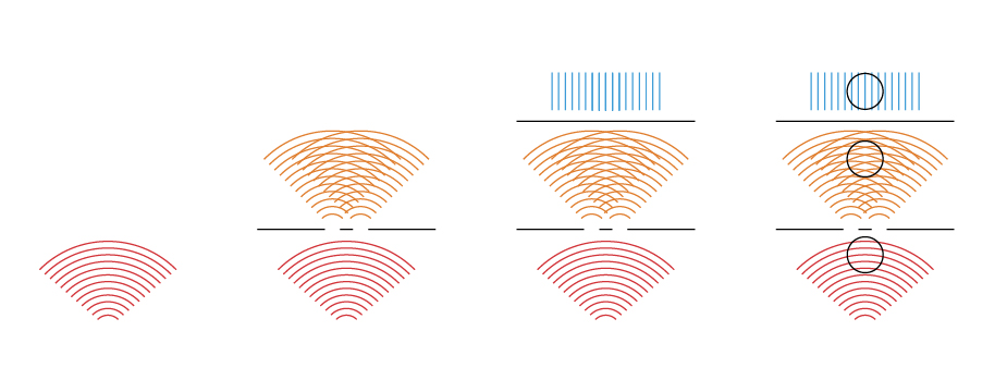
The Texas Quantum Summit 2025 logo is inspired by the double‑slit experiment, a foundational demonstration in quantum physics.
The experiment reveals wave‑particle duality: light and matter can behave like waves or particles depending on how they are measured. A coherent light source passes through two closely spaced slits, causing the light to diffract and interfere. This interference produces a pattern of alternating bright and dark bands the screen behind the slits.
A circular cropping encapsulates the evolving wave patterns from the three key phases of the double-slit experiment, symbolizing both wave-like and particle-like behaviors.

Color Scheme
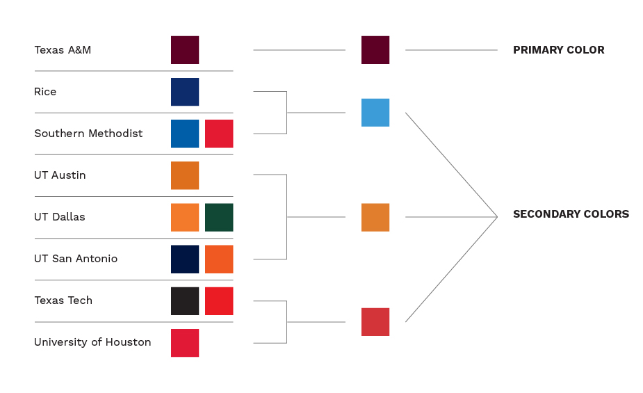
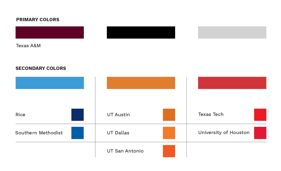
The color scheme is derived from the primary colors of the eight participating universities. Maroon, as the primary color, represents the 2025 host university Texas A&M.
As secondary colors, blue represents Rice University and Southern Methodist Uinversity, orange represents UT Austin, Dallas and San Antonio and Red represents Texas Tech University and the University of Houston.
This color scheme adapts to highlight the host university’s primary color, ensuring a dynamic and representative visual identity for each event.
Logo Versions
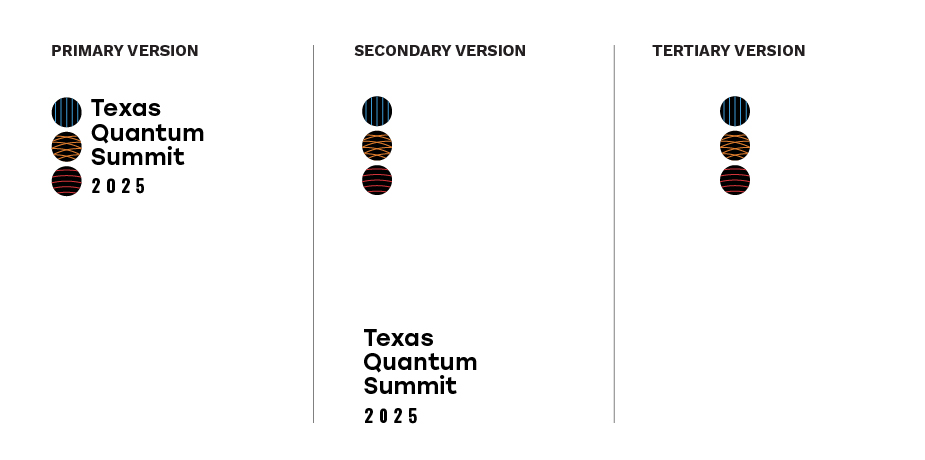
The logo has 3 different versions to allow for a flexible layout system. Usage mainly depends on the orientation and size of the deliverable.
Visual Elements
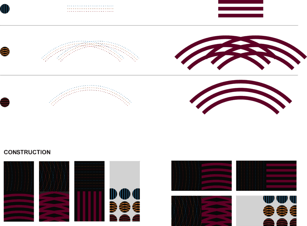
The visual is inspired by the waveforms of the experiment. Some strokes are dotted, nodding to particle‑like behavior, while others are bold and continuous, reflecting wave‑like motion. The dotted lines alternate in color using the secondary palette, whereas the bold continuous strokes use the primary maroon. These waves come together in opposing directions to add contrast and movement to the composition.
Iconography
The icon series employs the circular forms of the logo to serve as clear directional and identification signs.
